May 12, 2026
Behind the Scenes: The Making of Aurora’s Iconic Badge
As Minnesota Aurora moves into our 5th season of existence, we wanted to lift the curtain on some of the fun behind the scenes work that has made Aurora the organization what it is today. In this segment, co-founders Wes Burdine and Allie Schmidt are reflecting back on the branding process that led to our iconic logo design.
______
Long before Aurora took the pitch with our iconic badge on their kits, the founders were thinking about the brand. It needed to be memorable, feel unique to Minnesota, and cool. But what does that mean? As we would learn, ideas like “unique to Minnesota” are interpreted in wildly different ways by people from all walks of life. And a bad brand was just inconceivable.
Early on, the founders started kicking around names, thinking the best way to capture the public’s attention was to launch with a cool brand. But on a phone call with a friend, Peter Wilt–who launched some of the most memorable soccer brands in the US (Indy Eleven, Chicago Red Stars, Forward Madison), he said, “Never launch with a name, because the single greatest tool for engaging the community is a name-contest.” So we changed our approach to engage the community in the name.
What made us unique was our community owner structure: why not let the people investing in the club weigh in? We didn’t want a free for all… design by committee can be ungainly and produce some bad (though well-intentioned) ideas. But we DID set out to find a balance–community input, with well-thought out intention.
So our first step was to arrange a small committee of Minnesotans from different walks of life, some with design experience and others without it. We wanted to put together a long list of potential names that included names our community owners submitted. The long list of names should capture all sorts of Minnesotan concepts: animals (Whitetails, Grey Ducks), plants (Violets, Red Pine, Black Oak), Meteorological (Vortex, Aurora, Arctic), Historical (Trappers, Roaring), etc… But we started with a “no bad ideas” brainstorming that produced in fact many bad ideas.
For example, Wes tried to dig deep into Minnesota history and a few names appeared: Green Lantern (named for a famous speakeasy during prohibition), Ice Palace (for the St Paul Ice Palace), Suffragettes (we had the first women to vote after the 19th amendment, but also in the US they’re called Suffragists. He was simply overtaken by the idea of using David Bowie’s Suffragette City as an anthem). They’re bad names! Then there were other names that weren’t great, but we wanted to present a wide breadth of types of names for people to start to consider the possibilities.
The difficult part was that a name is only one part of a brand. There are plenty of great concepts that seem a bit flat if you only consider the name, but can capture attention once they have a fully fleshed out concept. Wes really thought Roaring Minnesota would be a killer brand–pulling from the concept of the Roaring 20s and using a Bee (“The Bee’s Knees”) as a central image. Roaring was kicked off the list in the first round (sigh). Maybe if we had simply presented three cool concepts, people would have loved it, but that’s how voting works!
An initial list of 14 names was whittled down to a shorter list of 8 names. From the beginning though, it was very clear that some names were standing out. In particular, people were freaking out about Aurora. We’ll admit, we were a little worried because the Aurora is a very difficult concept to depict visually. We thought it might lead to a really amorphous brand. It was really important for there to be a really iconic single image-like the Timbers’ axe, Arsenal’s cannon, the Liverbird. But we also knew to let our designers work. This was their problem to think through.
Two members of the committee that came up with the name lists were designers Carla Zetina Yglesias and Nicole Meyer.They had been introduced to us by designer friends and it was obvious from the first day that they would be perfect designers for this project, because of their love of soccer, but also their amazing talents. Our own founder, Allie Schmidt, joined them at first as the design expert in the founder group, but then as a co-designer. They had a tall task at hand… fully flushing out 3 complete brands within only 3-4 weeks.
To get the widest net of possibilities, the designers started with moodboards for each concept. They each presented one and as a group picked the final directions for each concept. We *tried* to have each designer to focus on one brand proposal (this was way harder than any of us expected – we were all too excited). The process was scrappy, at times a little unhinged, but the sheer amount of ideas and work created was astounding.
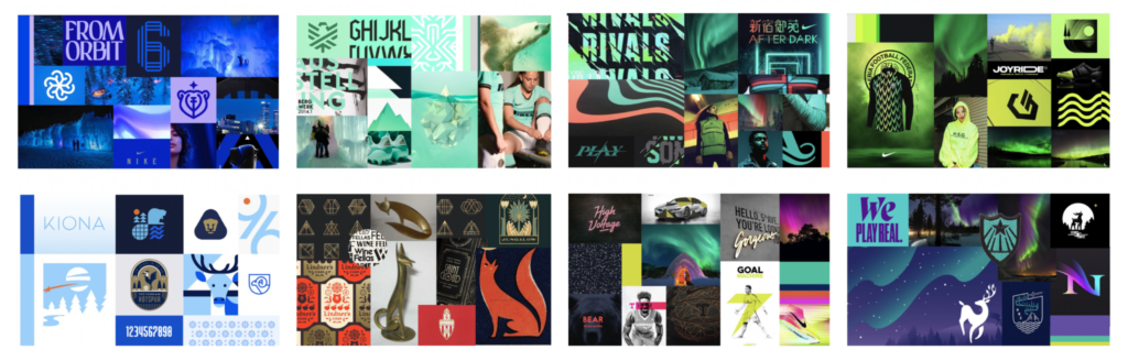
A selection of mood boards created for Arctic, Aurora & Foxfire.
We landed on four final concepts: Aurora, Arctic, Foxfire, and Vortex. However, we nixed Vortex because it wasn’t proving a fruitful concept (amorphous and hard to depict). The process of trying out ideas and digging through them was exciting–deer, polar bears, foxes, historical designs, modern designs–what would feel unique but also pass the test of time?
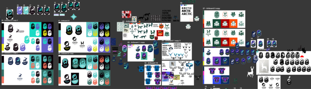
Straight from the art files: a look at one designer’s refinement process.
Refinement variations for the Aurora proposal
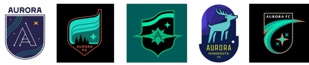
The final concepts presented to the Minnesota Aurora Board of Directors before the final refinements took place. The Design Team narrowed it down to the 3 concepts presented to the public after receiving their feedback.
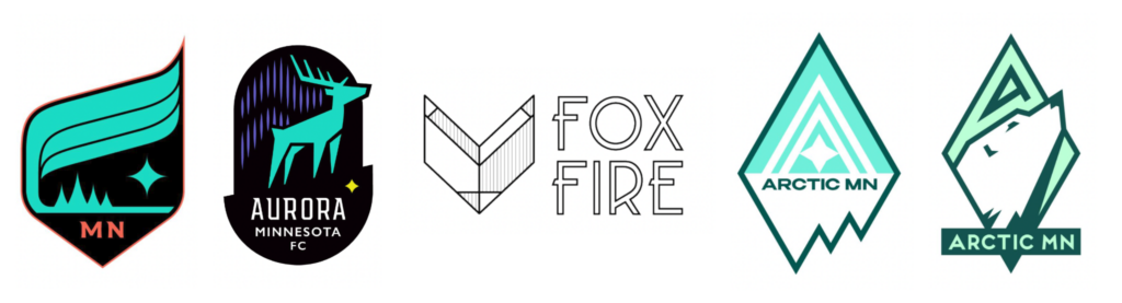
The Finalists
The results of the final three brands were as varied as the original list of names. Foxfire (a reference to the Aurora being “Revontulet” or “foxfire” in Finnish) was a stark geometric drawing of a fox’s head. It had a small group of supporters who loved how it echoed the superb Wolverhampton Wanderers logo, but also gave us a design that would look great when severed from the limiting “badge” design.
Arctic was stunning: a diamond badge with a polar bear that felt abstracted and geometric enough to not be overly cute. And then there was the unique “A” that could be used to represent the team as well.
But it was always Aurora. None of us could stop that train that had left the station a long time ago. Why? What was it about that word that captured peoples’ attention? It’s a fantastic, mellifluous word. It also gets to the Minnesotan meteorological obsession without being about the cold and misery (that was another problem with the “vortex” concept).
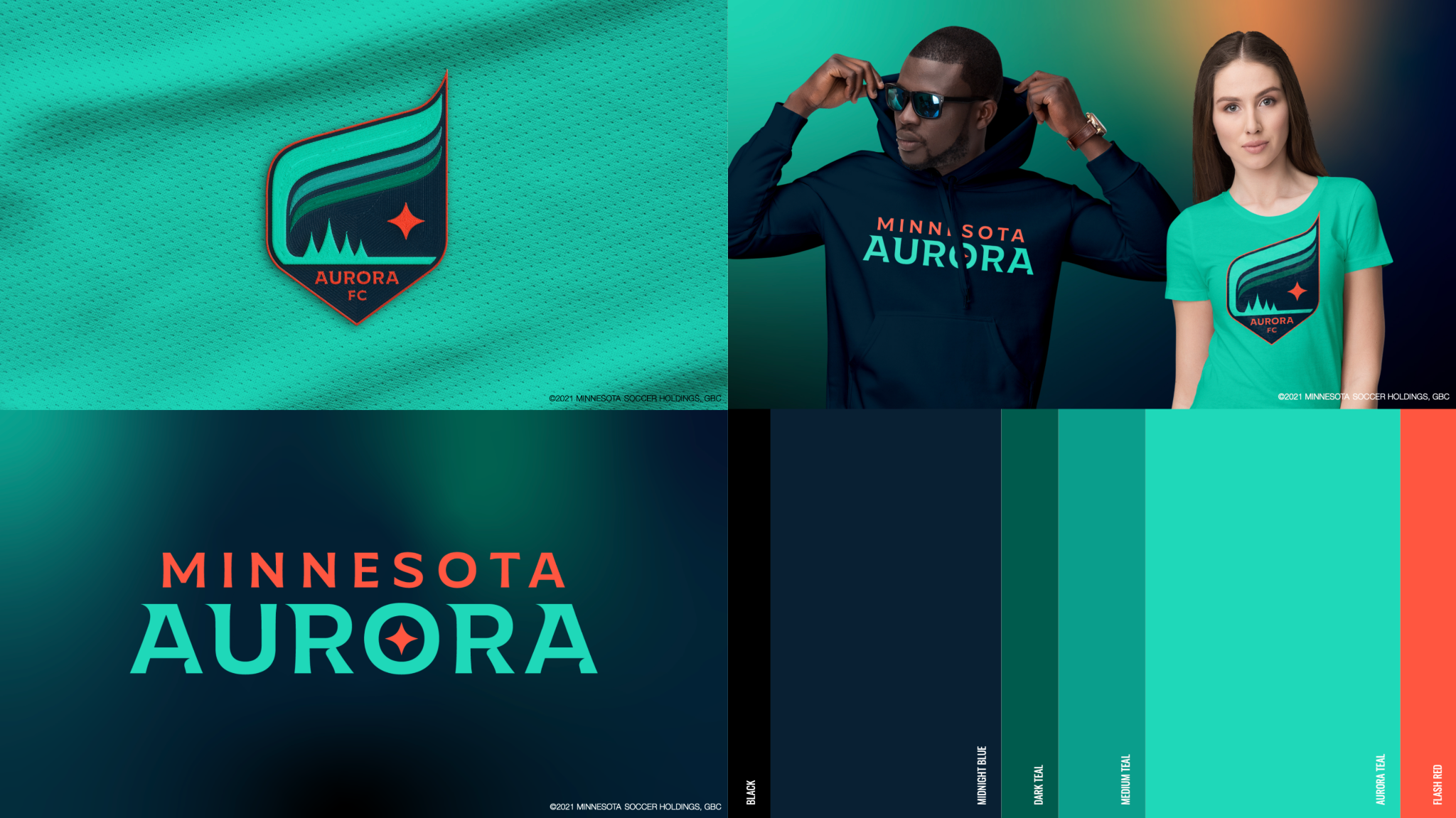
Aurora was a difficult concept though. You can’t quite represent it exactly or very literally. So do we avoid it and use something like a deer? The final logo combined a few basic elements. It gave a graphic, sweeping shape to the actual aurora, while using that shape to create a really unique badge shape. And as design often goes, you start to see a good idea gain momentum and realize itself.
We eventually presented the three final badges to our community owners at La Doña Brewing and on a live stream. When we put the Aurora design on the screen there was a loud gasp from a number of people in the room. We knew where this was going. It was always going to be Minnesota Aurora FC. It won in a landslide.
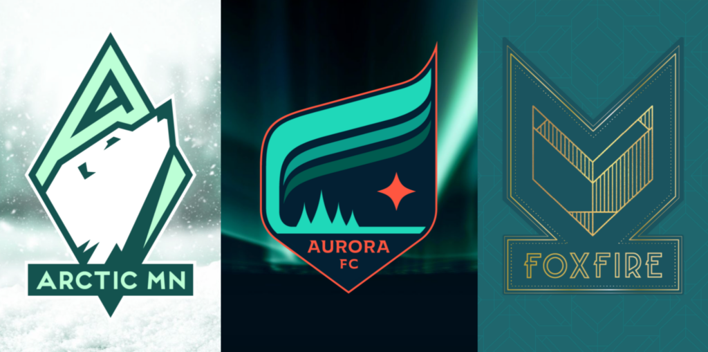
The final three brands that were revealed to the public on January 22, 2022.
The path to get there was about utilizing our designers immense talents–there’s nothing more important than trusting the people with the expertise. But it was also about harnessing the energy of the community owners. People willed this team into existence. They wanted it so bad and they wanted it to succeed so bad. And they brought that will to the design process, because they wanted a team that looked cool, that embodied their desire. The design process that unfolded was probably the single most important key to our success in the last five years.